Please view this case study on a larger display
Vanguard Year-In-Review
Designing to promote confidence, trust, and agency 
in navigating important decisions.
Target audience
Retirees, aged 50+, managing their retirement portfolios and seeking clear insights into their financial health and yearly performance.
Context
Deliverable: Prototype flow for 
desktop
Timeframe: 10 weeks
My role
UI/UX Designer & Researcher
Timeframe: 10 weeks
Research and Foundations
Project Introduction
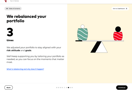
Vanguard's Year-In-Review feature provides investors with an annual summary of their portfolio performance, contributions, and market changes influenced by the Digital Advisor. Younger audiences were introduced first, but now they are seeking an audience of 50+ to gain insights on their retirements goals
The Challenge
Retirees make up a significant portion of Vanguard's client base
Current interface doesn't address unique needs of 65-80 age group
Flow doesn’t accommodate diverse financial 
backgrounds.
This project focuses on redesigning the Year-In-Review experience specifically for retirees, emphasizing clarity, accessibility, and actionable insights that align with their unique financial goals during retirement.

Usability Testing
We conducted usability testing as groups, guiding 3 50+ users through the current Year In Review to identify strengths and suggestions from the target audience.
Key Findings
- Difficulty interpreting technical terms
- Confusion around data visualizations and 
chart meanings
- Desire for contextual explanations of 
market performance
- Daunted by the length of the review
The research revealed that retirees prioritize having clarity about the metrics of their finances, external resources to explore their situation further, but also concise flows that don’t overwhelm with information.
View Usability Report
Audience Analysis
Vanguard's Year in Review audience consists primarily of adults aged 55-75 who are either retired or within 5-10 years of retirement. This audience is concerned with financial security and portfolio stability over aggressive growth strategies compared to earlier years of investing. According to the Pew Research Center, approximately 10,000 Baby Boomers turn 65 each day, representing a substantial number of retirees managing their own investments. These primarily college-educated users often possess mid to high levels of investment knowledge, owning diversified portfolios valued between $250,000 and $2 million. They also rely heavily on digital tools, both desktop and mobile apps, to monitor their retirement accounts, valuing clarity and transparency in how their financial status is communicated.
User Persona & Empathy Mapping
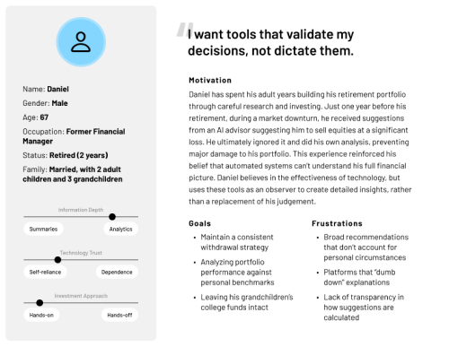
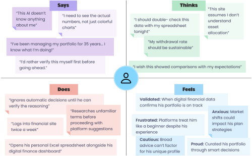
Meet Daniel! Daniel has spent his adult years building his retirement portfolio through careful research and investing. Just one year before his retirement, during a market downturn, he received suggestions from an AI advisor suggesting him to sell equities at a significant loss. He ultimately ignored it and did his own analysis, preventing major damage to his portfolio. This experience reinforced his belief that automated systems can’t understand his full financial picture. Daniel believes in the effectiveness of technology, but uses these tools as an observer to create detailed insights, rather than a replacement of his judgement.
This persona development became the groundwork for the redesign’s emphasis on adaptability, where contrasting users may have entirely different expectations for their experience with navigating the review. It was important to consider a balance of validation but also respectfulness.
Card Sorting
I conducted an open card sort with a classmate to understand how we naturally organize UI and elements when they are detached from the current experience.
Findings
- Distinctions between past, present, and future data visualizations
- Prevalence of modal windows inspired inclusion of more tooltips for external information
- Minimalist graphics went noticed during the analysis
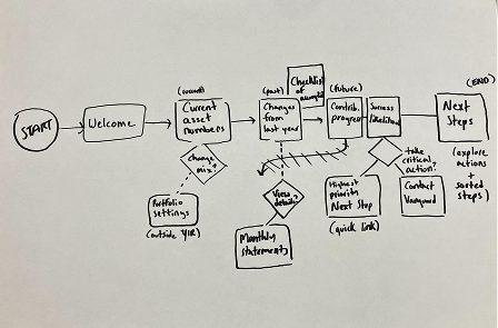
Although I did not conduct extensive re-organizing of 
individual elements within the final prototype, this exercise
 was critical in beginning to brainstorm significant changes 
in the page-to-page flow structure and adapt a narrative around the success likelihood metric.
Designing
Structure & Flow
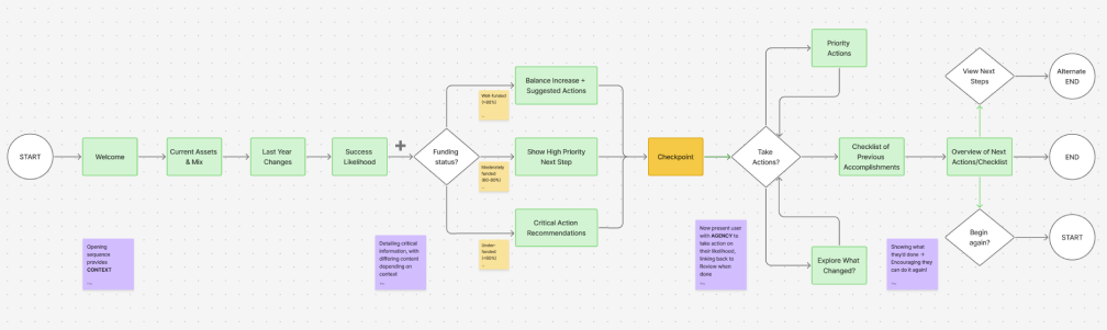
Based on card sort findings, I restructured the Year-In-Review into three main sections that aims to create a flow that is not only informative, but is structed as a cohesive narrative of progressively disclosing the year’s findings.
Phases
Context: Surveying the developments of portfolio settings,
described what had changed since the previous year.
Success Likelihood: The critical metric for an audience of 
retirees, now equipped with their current status.
Checkpoint: Diverge in narrative for those who wish to 
analyze or act on their scenario
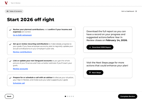
Actions: Comprehensive set of tasks order by priority
Each phase is not specifically defined but exists below the surface to guide an informed viewing of the experience.
Wireframes
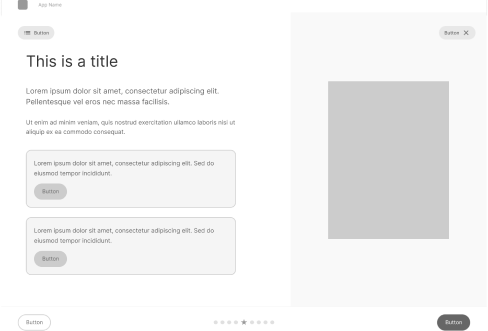
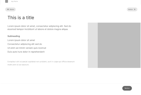
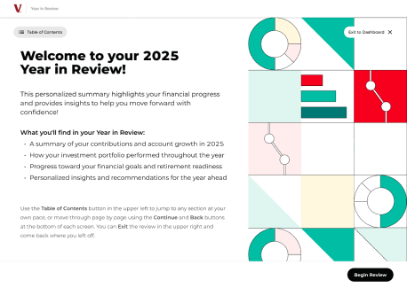
I created low-fidelity wireframes to explore how my new additions could be formatted within the Year in Review’s existing layouts. The biggest development during this stage was the updated navigation, now including a Table of Contents that further increases adaptability to the flow’s structure. The layout of the four navigation buttons creates an invisible box around the main content to frame it effectively.
UI Kit & Style Guide
The visual design utilizes Vanguard's existing brand while optimizing for readability and accessibility for older adults.
The current Year-in-Review employs hierarchy well through its primary font, which multiple platforms chose Montserrat as the closet match. The color palette also utilizes a balance of bold and pastel colors to create affect CTA’s and comforting accents.
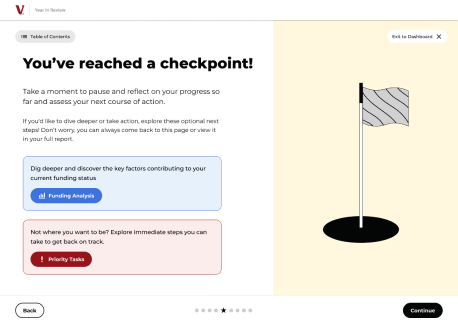
My custom components aims to integrate into the Year in Review’s current style by employing combinations of action/soft colors and generous padding. The Checkpoint cards reference the Suggested Action tooltips while the Table of Contents mirrors TurboTax’s sidebar navigation.
High-Fidelity Mockups
The final designs incorporate all research insights, structure considerations, and style guide decisions into finalized polished mockups. These frames utilize Vanguard's strong visual identity while considering new additions such as different means of navigation, less prominence on abstract graphics in favor of charts, and a warmer, more conversational tone that builds trust with the 50+ audience. Each screen balances information density with clarity, ensuring users feel informed without being overwhelmed.
View Hi-Fi Mockup
Full Prototype
The interactive prototype demonstrates the complete user flow from start to finish of exploring different sections of the Year-In-Review. It includes all key interactions such as expanding tooltips for definition details and utilizing the Table of Contents to jump to pages.
View Final Prototype
Reflection
Since I began learning UX design in my junior year, this class and the semester-long project have been among the most challenging yet positive experiences I’ve had as a designer. Our exploration of the research process through multiple curatorial approaches to accessible, empathetic design kept me curious about how I could apply these lessons in my future work. It was satisfying to see the knowledge I gained through our research materialize, and I was surprised that I was able to pull from so many of these studies to incorporate into this final product. It made the effort that was put into each step feel worth it.
One lesson I took from this project was the importance of balancing an experience so it’s intuitive and accommodating to diverse backgrounds, which was highlighted most during usability testing with our participants’ similarities and differences in how they interacted with the prototype. I was also introduced to the design thinking process, which has helped to mitigate my solution-first mindset and allow more time for rapid ideation. If I had more time allotted for this project, I would’ve conducted further usability testing after creating my redesign to help with iteration and considering what else could be changed. I would also modify more pre-existing screens to add more appropriate context, helping to situate viewers in the eyes of a retiree using the advisor. This final step of the process was unfortunately more rushed than I expected due to other finals, but I am proud I was able to produce a substantial portfolio piece through my efforts.
Overall, this project has been incredibly fulfilling to create and an amazing reference for organizing future UX projects. It has strengthened my fundamental design strategies and fueled me to always prioritize accessibility and diversity in the projects I develop!